Silque Haircare: Brand Identity & Packaging Design
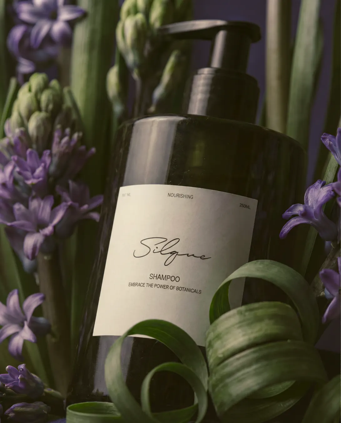
Project Overview
A refined brand identity for a modern haircare brand rooted in softness, nourishment, and everyday luxury.
Key Insight
Premium does not have to feel distant
Silque’s visual direction balances elegance with warmth, helping the brand feel elevated without feeling cold, overly clinical, or inaccessible.
Packaging needed to carry the brand story
The identity was designed to work beyond a logo. It needed to live beautifully across bottles, boxes, labels, product photography, and digital launch materials, creating a cohesive experience from shelf to screen.
Haircare is sold through feeling before function
Before customers read the ingredient list, they notice how the brand makes them feel. For Silque, the packaging needed to communicate softness, care, and premium quality at first glance, while still feeling clean, modern, and easy to trust.


Design Challenge
Silque needed a brand and packaging system that could stand out in a competitive beauty market while still feeling soft, refined, and trustworthy.
The challenge was to create packaging that felt premium enough for beauty retail, flexible enough for future product expansion, and emotionally aligned with the feeling of nourished, silky hair.


Our Approach
Built a refined brand identity
We developed a visual identity centered around softness, shine, and quiet confidence. The logo, typography, color direction, and supporting elements were created to give Silque a graceful yet recognizable brand presence.
Designed packaging for shelf appeal
The packaging system was crafted to feel polished, elevated, and desirable at first glance. Every detail, from hierarchy to spacing to visual balance, was considered to help the product feel premium and easy to understand.
Created consistency across product touchpoints
We designed the brand to translate across packaging, product labels, digital assets, and future launch materials, giving Silque a cohesive foundation that can grow with new products and collections.
Balanced beauty with usability
The packaging was not only designed to look beautiful, but to clearly communicate the product’s value, support customer decision-making, and strengthen trust in the brand.